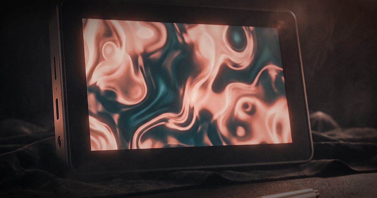

Before a viewer reads a caption, before a voiceover begins, before a single frame of text appears on screen — they have already felt something. That feeling is the work. Everything else is reinforcement.
Visual storytelling is not a technique reserved for cinema or luxury brands with limitless budgets. It is the fundamental grammar of how humans process meaning, and every business communicates in it whether they intend to or not. The only question is whether you are doing it consciously.
This is how you start doing it consciously.
What visual storytelling actually means
The phrase gets thrown around a lot, often as a synonym for "nice-looking content." But there is a more precise definition worth holding onto: visual storytelling is the deliberate use of image, motion, light, colour, and composition to communicate values, emotion, and narrative — without relying on language to carry the load.
That last part is the discipline. When you remove the words, you cannot hide behind clever copy. The frame has to do the work. A corporate office that feels warm and collaborative must look warm and collaborative — the open desks, the soft window light, the candid laughter caught mid-conversation. Tell the camera to find that, and it will. Ignore it, and no tagline will save you.
The brands that do this best share one habit: they decide what they want the viewer to feel before they decide what they want to show.
The five visual languages your brand is already speaking
Whether you have a defined visual strategy or not, your brand is already communicating through these five channels. Understanding them is the first step to controlling them.
1. Colour Colour is processed before form. It triggers emotional associations faster than conscious thought. Warm terracottas suggest craft and tradition; clean whites and greys lean clinical or modern; deep navy carries authority; washed-out pastels feel intimate and human. The palette you choose across video, photography, and your website is not decoration — it is your brand's emotional signature.
2. Light Hard, directional light creates drama and contrast. Soft, diffused light feels safe and approachable. Golden-hour warmth reads as aspirational and fleeting; fluorescent overhead reads as institutional. Most brands never think deliberately about light, which is precisely why lighting decisions are one of the highest-leverage choices in any production.
3. Composition and framing Where subjects sit in the frame communicates power, relationship, and mood. A subject filmed from slightly below feels authoritative. The same person filmed at eye level feels like a peer. Negative space around a product communicates premium. Tight, busy frames communicate energy and movement. Every crop is an editorial decision.
4. Motion and rhythm In video, the pace of cuts mirrors the pace of thought. Slow edits with long takes invite reflection; fast cuts with kinetic movement create urgency and excitement. Camera movement matters too: a slow push-in builds intimacy; a handheld follow shot puts the viewer inside the action. The rhythm of a film is its heartbeat — and audiences feel it even when they cannot name it.
5. Texture and materiality The surfaces you choose to photograph and film carry meaning. Raw concrete, aged wood, polished steel, rough linen — each carries a set of cultural associations that attach themselves to your brand. Showing a product in a context of quality materials elevates it. Showing it against cheap or incongruous surfaces undermines every other effort.
The three-layer framework for building a wordless brand narrative
A useful way to structure your visual storytelling is across three layers, each doing a different kind of narrative work.
Layer 1: Identity (who you are)
This is the visual expression of your values and personality. It lives in your colour grade, your preferred shooting environments, your casting choices, your typography on screen, and your aspect ratio choices. It answers the question: if someone muted this film and watched twenty seconds of it, would they know it was yours?Strong identity layer examples: a consistent warm-toned grade across all content; always shooting in real locations rather than studios; always featuring people in motion rather than posed portraits.
Layer 2: Context (what world you inhabit)
This is the environment you build around your brand. The locations, the era, the texture of the world your product or service lives in. A fintech company filming in light-filled modern co-working spaces is telling a very different story than one filming in dark, glass-walled boardrooms — even if both are selling the same product.Context is where location scouting and production design earn their fees. The background is never neutral. At TNG, some of our most effective brand films for clients have been built almost entirely around location — Porto's tiled facades, the riverside warehouses, the Atlantic light at dusk — because the place carried meaning the product could borrow.
Layer 3: Moment (what you make people feel)
This is the emotional peak of your visual story. It is the frame that would work as a poster. The look between two people. The product catching the light at exactly the right angle. The aerial shot that makes the viewer catch their breath.Great visual storytelling engineers these moments rather than hoping they happen. They are planned in pre-production, scouted, lit, and shot with intention. And they are the frames that people share, save, and remember.
Practical tools: what actually creates meaning without words
Theory is useful, but the following are concrete production choices that move the needle.
- Casting authenticity over beauty. Faces that feel real and specific are more emotionally engaging than conventionally attractive faces that feel generic. Your audience recognises real people.
- Sound design as a visual complement. Sound is half of any moving image. The ambient texture of a room, the specific sound of a material being handled, the music's emotional register — these are as much part of the story as anything on screen. Wordless films are never silent.
- The establishing shot as a promise. The first wide shot of a film sets the contract with the viewer. It tells them what kind of experience to expect. Spend time on it.
- Colour grading with intention. Post-production colour is where many brands leave enormous value on the table. A consistent, deliberate grade unifies all your content into a recognisable world. It is the visual equivalent of a signature.
- Movement over stillness. Even in photography, implied motion (a coat mid-billow, a hand reaching, a turned head) creates energy and narrative. Static, posed images communicate control; dynamic images communicate life.
The brand film vs. the social cut: adapting the story to the format
One visual story can and should live across multiple formats — but each format has its own grammar.
A brand film (90 seconds to four minutes) can build tension, breathe, and take its time. It earns the right to be slow because the viewer has opted in. This is where your three-layer narrative gets full expression.
A social cut (15 to 30 seconds) must hook in the first two seconds and pay off before the viewer scrolls. It sacrifices breath for punch. The strongest social cuts are usually extracted from a longer film, built around that single Layer 3 moment — the one frame that carries everything.
A photography series for editorial or product use does similar work in still form: each image must communicate independently while cohering as part of a larger visual world.
The brands that do this most effectively plan all three formats simultaneously in pre-production, rather than trying to retrofit content after the fact. Shooting a brand film? Brief the photographer to shoot alongside it. Plan the social selects before you start rolling. This is the full-service, integrated approach that saves budget and produces more consistent output — and it is precisely how we structure productions here at TNG.
Common mistakes that break the wordless story
Even well-resourced brands fall into predictable traps.
Over-explaining. Adding a voiceover that literally describes what is on screen destroys the emotional work the image was doing. Trust the image. If the frame shows warmth, you do not need the narrator to say "we care about our people."
Inconsistency across touchpoints. A cinematic brand film paired with flat, poorly lit social photography is a brand in contradiction with itself. Visual storytelling only works as a system.
Chasing trends instead of building identity. Every few months there is a new visual aesthetic circulating — a specific colour grade, a transition style, a motion graphic trend. Brands that adopt these uncritically sound like everyone else. Trends can inform; they should not dictate.
Underinvesting in pre-production. Most visual storytelling problems are solved before the camera is ever switched on. Mood boards, location scouts, casting, shot lists, lighting plans — these are where stories are actually built. The shoot is the execution of decisions already made.
Conclusion: earn the silence
The most powerful brand communications are the ones that do not need to explain themselves. They arrive, they make you feel something specific and intended, and they leave. The viewer does the rest.
Getting there requires treating visual language with the same rigour you would apply to written copy or a sales argument. Every frame is a choice. Every choice communicates. When those choices are made deliberately and consistently, they accumulate into something audiences recognise, trust, and remember.
That is the standard worth aiming for — and it is entirely within reach.