Motion has always been persuasive. Long before social media algorithms rewarded video content, moving images commanded attention in ways that static visuals simply could not. What has changed dramatically in recent years is the precision, accessibility, and creative ambition of motion graphics — and the speed at which trends move through the industry.
For brand content teams, keeping pace is not optional. The visual language a brand uses to move on screen is as much a part of its identity as its logo or typeface. Get it right, and animation becomes a fluent extension of who you are. Get it wrong, and even well-funded campaigns can feel dated before the campaign ends.
Here is what is genuinely shaping the field right now, and why it matters for brands of every size.
Kinetic typography grows up
Text-in-motion is nothing new, but the craft around it has matured considerably. Where kinetic typography once meant words flying in from the edge of frame, today's executions are far more considered. Letters breathe, stretch, and respond to the rhythm of a voiceover or a soundtrack in ways that feel organic rather than mechanical.
The shift is partly technical: tools have become powerful enough to allow frame-by-frame refinement without prohibitive production time. But it is also cultural. Audiences raised on short-form video have developed a sharp eye for lazy animation, and they disengage fast.
What works now:
- Variable-weight type animation, where letterforms shift weight mid-word to emphasise meaning
- Baseline choreography, subtle vertical movement that mimics the cadence of spoken language
- Texture overlays on text, lending print-inspired grain or paper feel to digital type
Liquid and organic motion
Geometric motion design had a long run. Clean shapes, hard edges, and mathematical transitions dominated brand animation for the better part of a decade. The counter-movement is well underway.
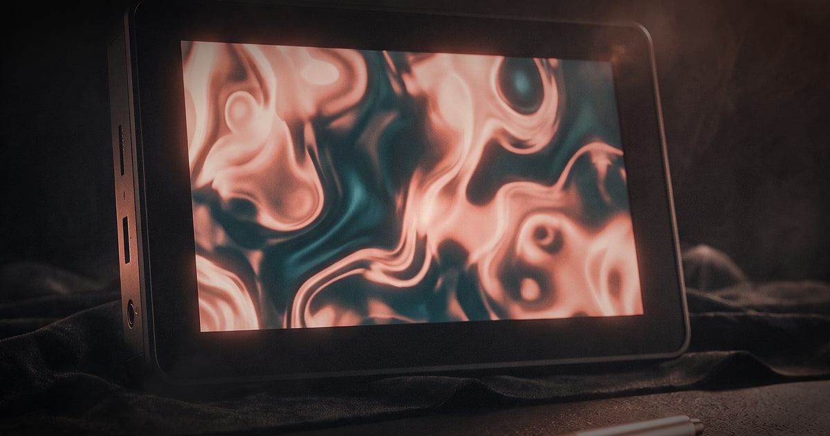
Organic, fluid motion — blobs, morphing gradients, and liquid transitions — now signals warmth, creativity, and approachability. Brands in health, wellness, fintech, and even B2B SaaS have adopted this visual language to soften what might otherwise feel like cold or complex categories.
The technique works because it is inherently satisfying to watch. Human perception is wired to follow flowing, unpredictable movement. A well-executed liquid transition between two brand colours holds attention in a way that a hard cut simply does not.
Practically, this trend pairs well with bold colour palettes. The interaction between moving colour fields creates depth without requiring three-dimensional modelling, which keeps production timelines manageable.
3D integration in everyday brand content
Until recently, three-dimensional animation sat firmly in the premium tier — reserved for automotive commercials and pharmaceutical visuals. Advances in real-time rendering engines and more accessible 3D tooling have changed that calculus.
Brands are now integrating subtle 3D elements into what would traditionally be flat motion graphics: a product rotating softly in a social story, a logo reveal with genuine depth, a data visualisation where numbers lift off the surface. The effect is not to overwhelm but to add tactility.
A word of caution though: 3D is expensive to do well, and expensive to do badly. Half-committed 3D work, where depth is implied but the lighting is unconvincing, can undermine brand credibility far more than clean 2D would. The craft still matters enormously.
At TNG, when clients come to us with 3D ambitions on realistic budgets, we often find the most effective solution is a hybrid approach — combining real footage (product macro shots, for instance) with 2D graphic layers, giving the impression of dimensionality without the overhead of full 3D rendering pipelines.
Scroll-triggered and interactive animation for digital
The boundary between motion graphics and web design is increasingly porous. As brands invest more in digital-first experiences, animation is no longer confined to video files — it lives inside the browser itself.
Scroll-triggered animation, where elements animate in response to a user's scroll position, has become a standard expectation for premium brand websites. Parallax depth, content that fades and translates into view, SVG path animations that draw as you scroll — these techniques transform a static webpage into a narrative experience.
The discipline required here is restraint. The brands getting it right understand that every animated element should serve communication, not perform for its own sake. A hero section that takes five seconds to load and distracts from the value proposition is worse than no animation at all.
This is an area where motion design and web development must work from the same brief from the very start. When they are designed in isolation and bolted together later, the results are almost always compromised.
AI-assisted animation: a tool, not a replacement
Generative AI has entered the motion design conversation loudly, and the noise around it often obscures what it is actually useful for. In practical terms, AI tools are accelerating certain production phases considerably — in-betweening, background generation, rotoscoping, and rough animatics — while the core creative direction and craft remain firmly human-driven.
For brand content, this has a meaningful implication: production cycles can be compressed, which means more iteration is possible within a given budget. A team that once had time for one or two rounds of revision on an animated sequence can now afford three or four, which tends to produce better creative outcomes.
What AI cannot do well yet is maintain consistent brand identity across an animation. Colour accuracy, the precise weight of a typeface, the specific feel of a brand's motion language — these require a human eye and institutional knowledge of the brand. The best studios treat AI as a capable assistant, not a creative director.
Data-driven animation and motion infographics
Information design has always been part of the motion graphics toolkit, but the category has expanded significantly. Brands that generate interesting data — whether about sustainability metrics, product performance, user behaviour, or industry trends — are finding that animated infographics outperform static equivalents by a wide margin on social platforms.
The reason is straightforward: animation adds sequencing. It reveals information progressively, controlling what the viewer sees and when, which is a powerful editorial tool. A bar chart that builds itself over two seconds is inherently more engaging than one that simply appears.
For B2B brands in particular, motion infographics offer a way to communicate complexity without dumbing it down. A well-animated data sequence can walk a viewer through a nuanced argument in thirty seconds that a written report would take five pages to cover.
The craft considerations:
- Keep colour palettes restrained — too many colours in motion become chaotic
- Allow numbers to count up from zero when revealing statistics; it is a simple effect but consistently effective
- Pair animation with voiceover or ambient sound design; silence often undermines data storytelling
Sound design as the invisible animation layer
Speaking of sound — it is the most undervalued element in brand animation. Motion without sound is motion at half-power. The right audio layer does not just accompany movement; it creates the perception that animation is more refined, more premium, and more intentional than it may objectively be.
Sound design for motion graphics is distinct from music. It is the craft of creating subtle audio events that correspond to visual beats: the soft tick of a text element landing, the gentle swoosh of a transition, the resonant hum of a logo settle. Done well, the audience is not consciously aware of it. Removed, they would immediately feel something is missing.
This is an area where post-production capability makes a significant difference to the finished product. At TNG, sound design is integrated into our post-production process from the first cut — not added as a final step — because the relationship between sound and motion needs to be built, not applied.
What this means for your brand
The brands winning with motion graphics in 2025 share a few common traits. They treat animation as a communications tool, not a decorative layer. They invest in consistency across formats, so motion feels like an extension of brand identity rather than a collection of unrelated executions. And they work with production partners who understand both the craft and the strategy behind it.
Motion graphics and animation are no longer a luxury reserved for brands with broadcast budgets. With the right partner and a clear creative brief, even lean campaigns can carry genuine visual ambition. The gap between good and great motion, today, is mostly craft and intention — not budget alone.
If your brand content is ready to move, we would be glad to talk about what that could look like.