
Before your audience reads a single line of copy, they've already formed an opinion about your brand. In the first few seconds of encountering your content — a video, a photograph, a colour palette, a composition — the human brain has already processed emotion, trust, and relevance. That's not a metaphor. It's neuroscience.
Visual storytelling is one of the most powerful tools available to modern brands, and yet it remains one of the most misunderstood. It's not about beautiful images for their own sake. It's about crafting a visual language so coherent and intentional that your audience feels who you are before they ever consciously think about it.
This is the craft behind the world's most iconic brand communications — and it's entirely within reach, whatever the size of your business.
What Visual Storytelling Actually Means
There's a common misconception that visual storytelling simply means "using good photos or videos." It's far more architectural than that. Visual storytelling is the deliberate use of imagery, motion, colour, composition, light, and pacing to communicate values, emotion, and narrative — without relying on text to carry the message.
Think about it this way: if you removed every word from your website, your social content, and your brand films — would a stranger still understand what you stand for? Would they feel something?
The brands that answer "yes" to that question have invested in a consistent, intentional visual identity. Every frame they publish is a sentence in a larger story.
The Three Pillars of Visual Brand Language
To build a coherent visual narrative, most successful brands operate around three foundational pillars:
- Aesthetic — the look and feel: colour grading, texture, lighting style, and the overall mood of imagery
- Composition — how subjects, space, and movement are arranged within a frame to guide the eye and convey hierarchy
- Pacing — in video especially, the rhythm of cuts, transitions, and the speed at which information is revealed
Light Is Your First Narrator
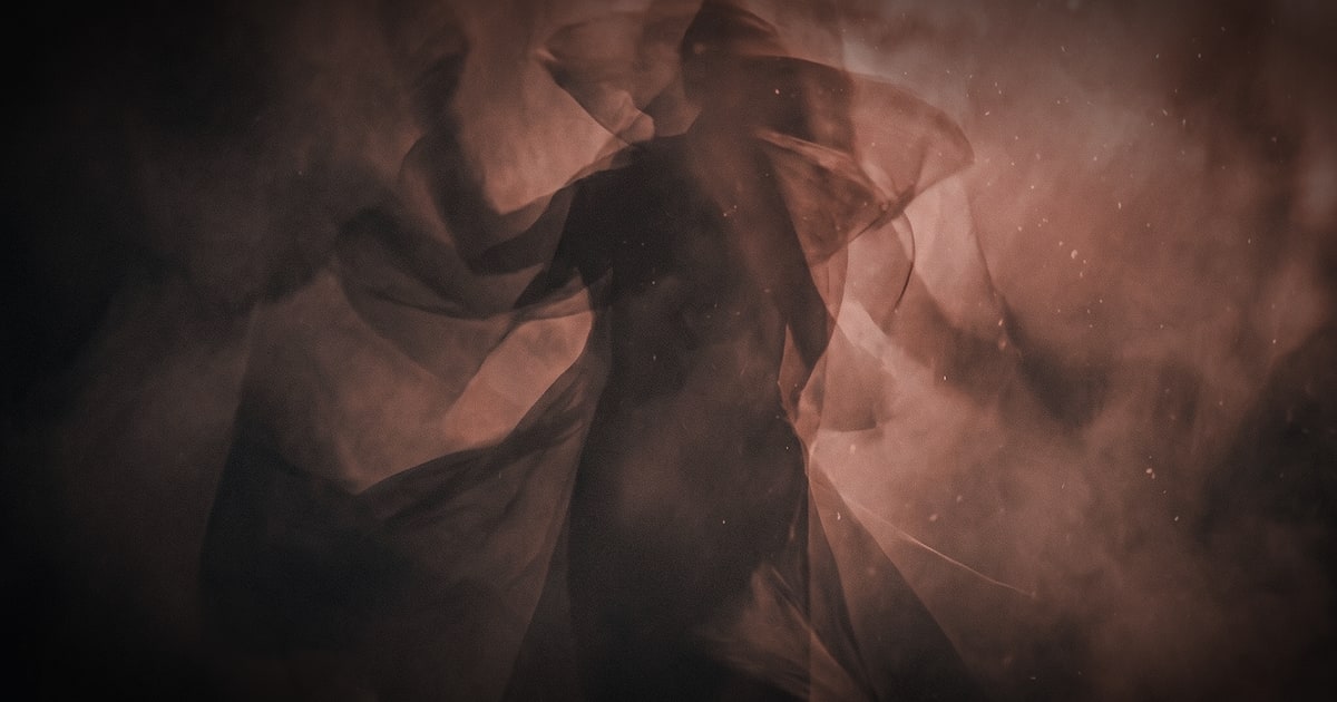
Photography and videography professionals often say that light is the first decision, not the last. And that's no accident. Light carries extraordinary emotional weight.
Hard, directional light communicates drama, tension, and authority. Soft, diffused light suggests warmth, approachability, and intimacy. Golden-hour light evokes nostalgia and aspiration. Cold, blue-tinted light reads as futuristic, clinical, or sophisticated.
Before any camera rolls, the right production team asks: what do we want the audience to feel? The answer dictates the lighting setup. This is why two brands in the same industry can shoot in the same city and produce content that feels completely different — one urgent and bold, the other calm and luxurious.
At TNG, our cinematographers and photographers approach every brief by mapping emotion first, then reverse-engineering the visual conditions to produce it. It's a discipline that transforms a shoot from a documentation exercise into an act of storytelling.
Colour Grading: The Invisible Emotional Layer
If light is the first narrator, colour grading is the silent co-author. In post-production, colour grading goes far beyond adjusting exposure and contrast — it's the process of painting an entire emotional atmosphere over footage or photography.
Consider how differently you feel watching a warm, amber-toned brand film versus a cold, desaturated one. The subject matter could be identical. The emotion is entirely different.
Colour grading is where many brands leave significant value on the table. Raw footage — even beautifully shot footage — often feels flat and generic until it passes through skilled colour work. A consistent grade applied across all your visual assets acts like a tonal fingerprint, making your content instantly recognisable in a crowded social feed.
Practical colour principles to borrow from cinema:
- Complementary colours (e.g., orange and teal) create visual tension and energy — popular in high-impact brand films
- Analogous palettes (colours close together on the wheel) feel harmonious, calm, and premium
- Desaturated, muted tones signal maturity and sophistication
- High contrast, vivid saturation signals youthfulness, energy, and disruption
Composition and the Grammar of the Frame
Every frame your brand publishes communicates something through its composition — consciously or not. Composition is the visual grammar that tells the viewer where to look, what matters, and how to feel about the relationship between elements.
Rules Worth Knowing (and Breaking)
The rule of thirds divides the frame into a 3×3 grid and places key subjects along those lines rather than dead centre — creating images that feel naturally dynamic rather than static. It's a baseline, not a ceiling.
Negative space — the deliberate use of empty space around a subject — communicates confidence, luxury, and clarity. Brands like Apple have built entire visual identities around it.
Symmetry evokes balance, order, and authority. It's used extensively by financial institutions, luxury houses, and architectural photography.
Dutch angles and movement introduce unease, energy, or modernity. They signal that a brand is not standing still.
The key isn't following rules — it's understanding why they work so you can use them (or subvert them) with intention.
Motion: The Dimension That Changes Everything
Static imagery tells a story. Motion immerses you in one. Video remains the highest-engagement content format across virtually every platform and audience segment, and it's not hard to understand why: motion triggers our most primal attention mechanisms.
But effective brand video isn't about production budget — it's about intention. Some of the most emotionally powerful brand films ever made were shot simply, with minimal resources. What made them work was narrative clarity and emotional truth.
When producing brand video content, consider these storytelling levers:
- Opening frame — you have roughly three seconds to earn continued attention. What does your first frame say?
- Pacing and rhythm — fast cuts energise; slow, lingering shots build depth and contemplation
- Sound design — music, ambient audio, and silence are as much part of the visual story as the images themselves
- The absence of dialogue — some of the most effective brand films contain no spoken words at all, relying entirely on imagery, music, and motion to carry emotional weight
Building a Consistent Visual World
Individual great images are impressive. A consistent visual world is transformative.
The brands that truly master visual storytelling don't treat each piece of content as a standalone asset. They treat every image, every video, every frame as part of a living, breathing universe — one that reinforces the same values, emotions, and aesthetic choices at every touchpoint.
To build that consistency, define your visual identity with the same rigour you'd apply to your verbal brand guidelines:
1. Mood board your aesthetic — collect reference imagery that captures how you want your brand to feel, not just look 2. Define your colour story — establish a primary palette and a consistent grading direction for all visual output 3. Decide on a compositional style — minimal or layered? Symmetrical or dynamic? Intimate or epic? 4. Set a motion language — if you produce video, define your pacing, transition style, and camera movement preferences 5. Audit regularly — visual identity drifts. Quarterly audits of your visual output help maintain coherence
Aerial and Environmental Storytelling
One visual dimension that is often underutilised by brands is scale and environment. Where a story unfolds is as expressive as who tells it or how it's framed.
Aerial photography and drone cinematography, for instance, don't just provide dramatic wide shots — they contextualise a brand within its world. A coastal hotel filmed from above communicates freedom, luxury, and natural beauty in a single frame that no interior shot could replicate. A manufacturing facility seen from the air communicates ambition and scale.
The environment your brand inhabits — Porto's layered, textured streets; the geometric elegance of a Parisian courtyard; the raw energy of a trade show floor — is itself a narrative element. The best visual storytelling doesn't fight its environment; it reads it.
Your Visual Story Is Already Being Written
Every image you publish, every video you post, every frame your audience encounters is already telling a story. The question is whether that story is intentional or accidental.
The brands winning on visual communication are not necessarily the ones with the largest budgets. They're the ones who understand that every creative decision — from the warmth of a lighting setup to the rhythm of a video edit — is an act of communication. They treat visual production not as a cost centre but as one of their most powerful strategic tools.
Whether you're building a brand from scratch or refining one that's been around for decades, the opportunity is the same: get intentional about your visual language, and let your images do the talking long before your words ever do.
That's the real power of visual storytelling. And it starts with a single, deliberate frame.